Plant Skate Co. is an independent skatewear brand with a darker, more refined aesthetic—built for those who skate with purpose and edge.
Client
Plant Skate Co.
Category
Brand Identity
Date
May 2021
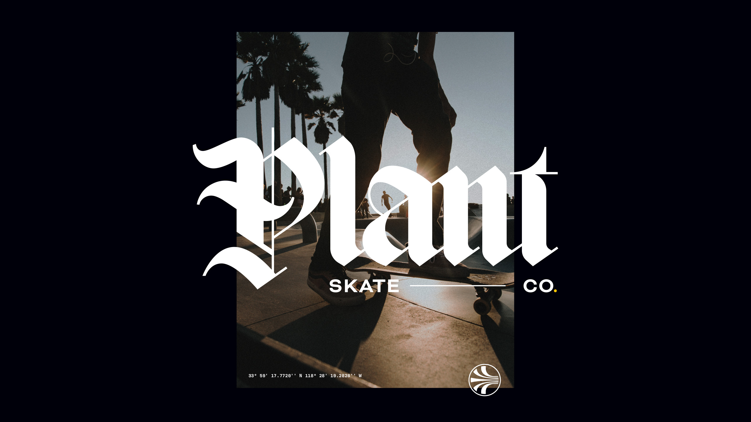
A custom identity that fuses gothic energy with modern clarity—balancing attitude with craftsmanship.
Plant Skate Co.
Skatewear with edge, crafted with intent
Plant Skate Co. is a skatewear brand that stands apart from the loud, chaotic energy typically found in the scene. With a more considered, gothic-inspired aesthetic, the aim was to create a brand that feels rooted, raw, and intentional.
The design process focused on combining tradition and rebellion—exploring the tension between classic blackletter forms and clean, contemporary detailing. The result is a visual identity that feels fresh but familiar, dark but refined, and built to resonate with a new wave of skaters who care as much about design as they do about lines.
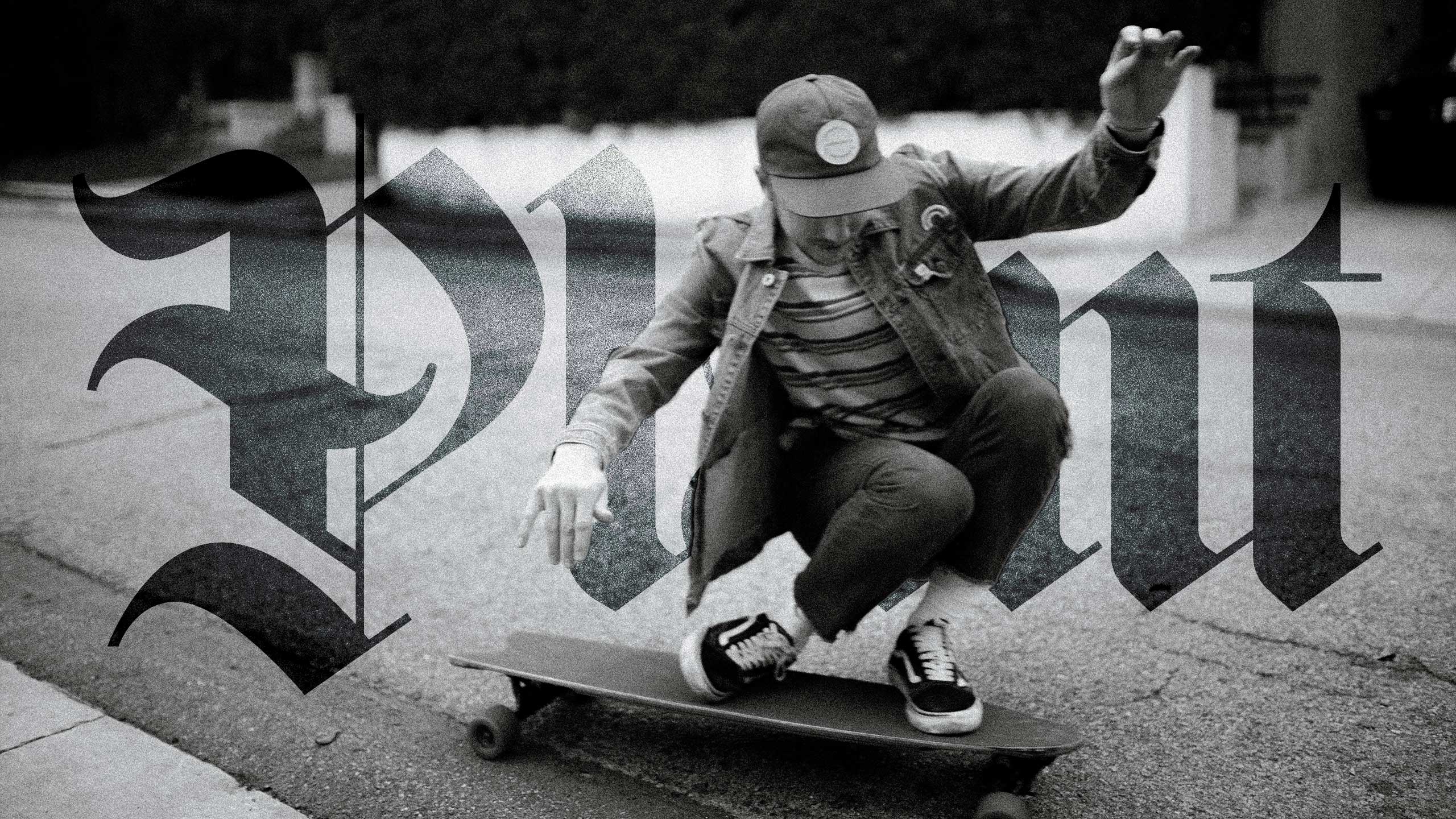
Typography with teeth
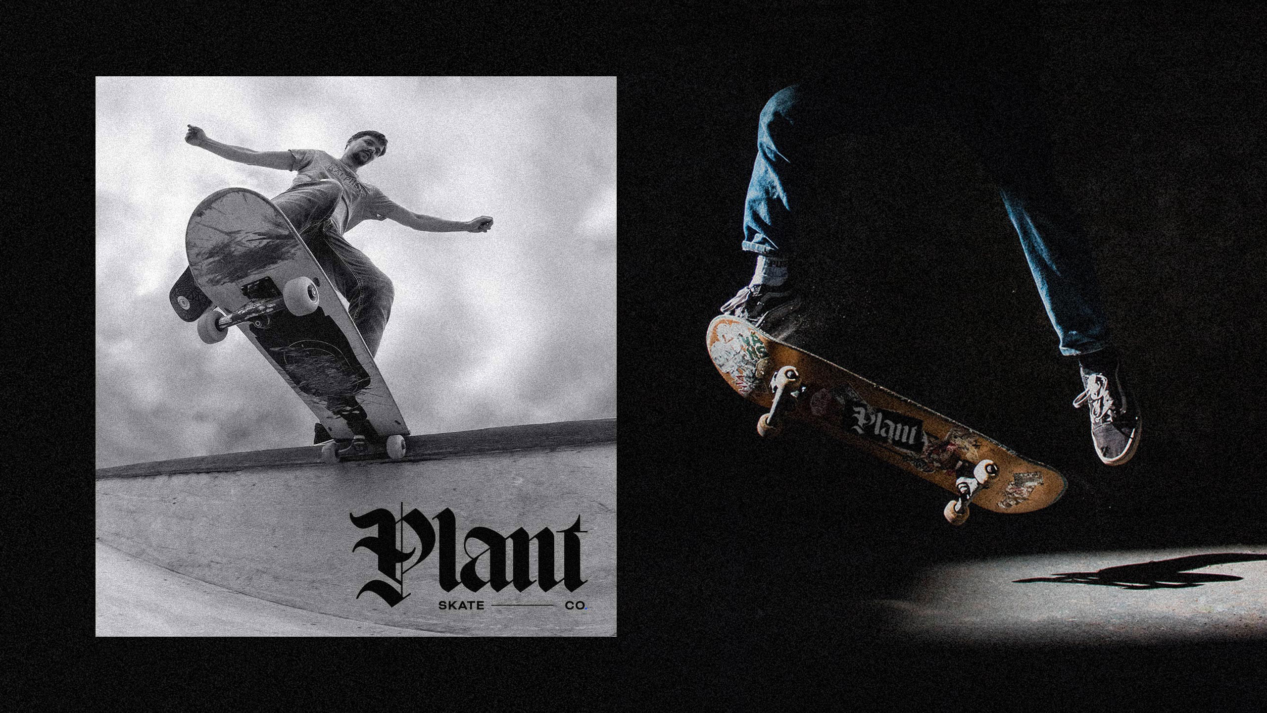
At the heart of the identity is a custom wordmark that reimagines blackletter through a minimalist lens. The type system leans heavy and sharp, offering a sense of weight and heritage without falling into nostalgia.
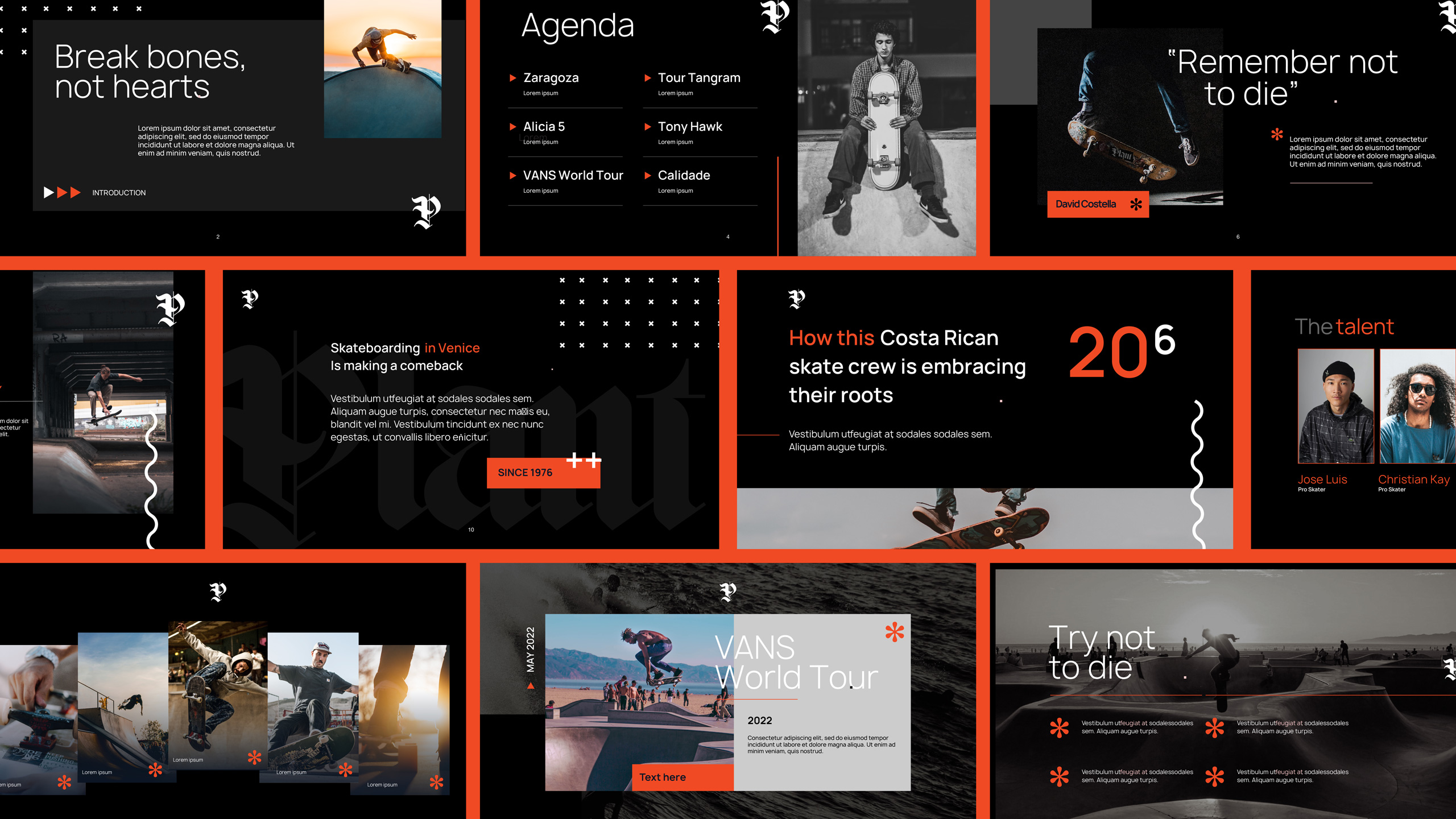
A moody, tactile palette
We built a muted, desaturated colour palette that gives the brand a raw, grounded tone—eschewing neons or brights in favour of something more grown-up and enduring. It’s skatewear with substance, not noise.
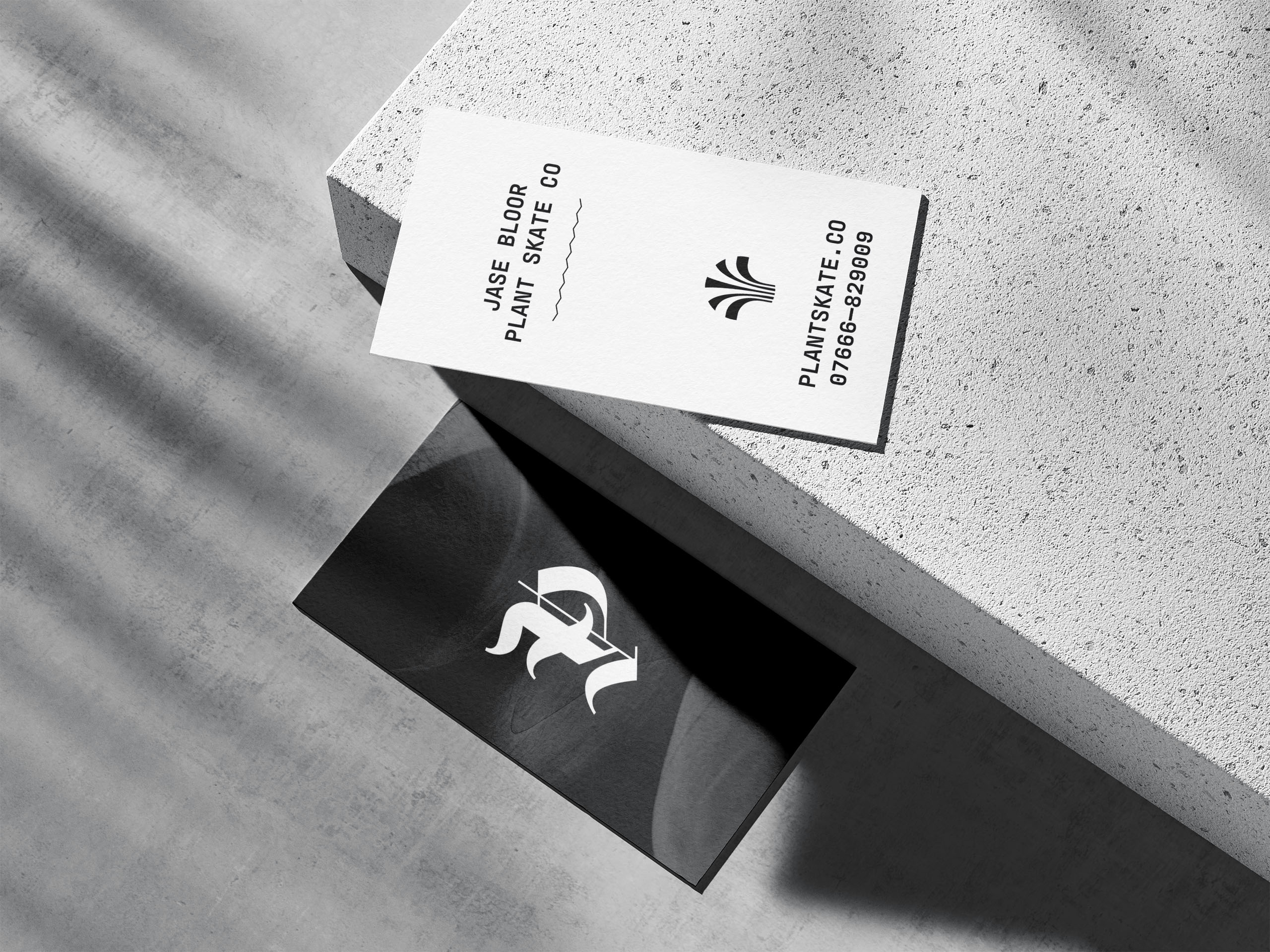
Independent spirit, built to scale
The identity was crafted to work across everything from apparel to packaging to digital—adaptable but distinctive. Whether stamped on grip tape or printed on heavyweight cotton, the brand holds its own.

 Prev
Prev
